As the sole designer on the team, I collaborated with the product manager and the programmer to redesign a 30-year-old visual programming tool for middle school students. Under tight constraints, I focused on improving the overall experience by modernizing the interaction
Timeline
Aug 2025 - Dec 2025
Project
Shipped product
Role
UI/UX Designer Intern
Tools
UX Research methods
Figma
PRELIMINARY RESEARCH
Background Research
How to optimize the UI and UX of a 30-year-old software?
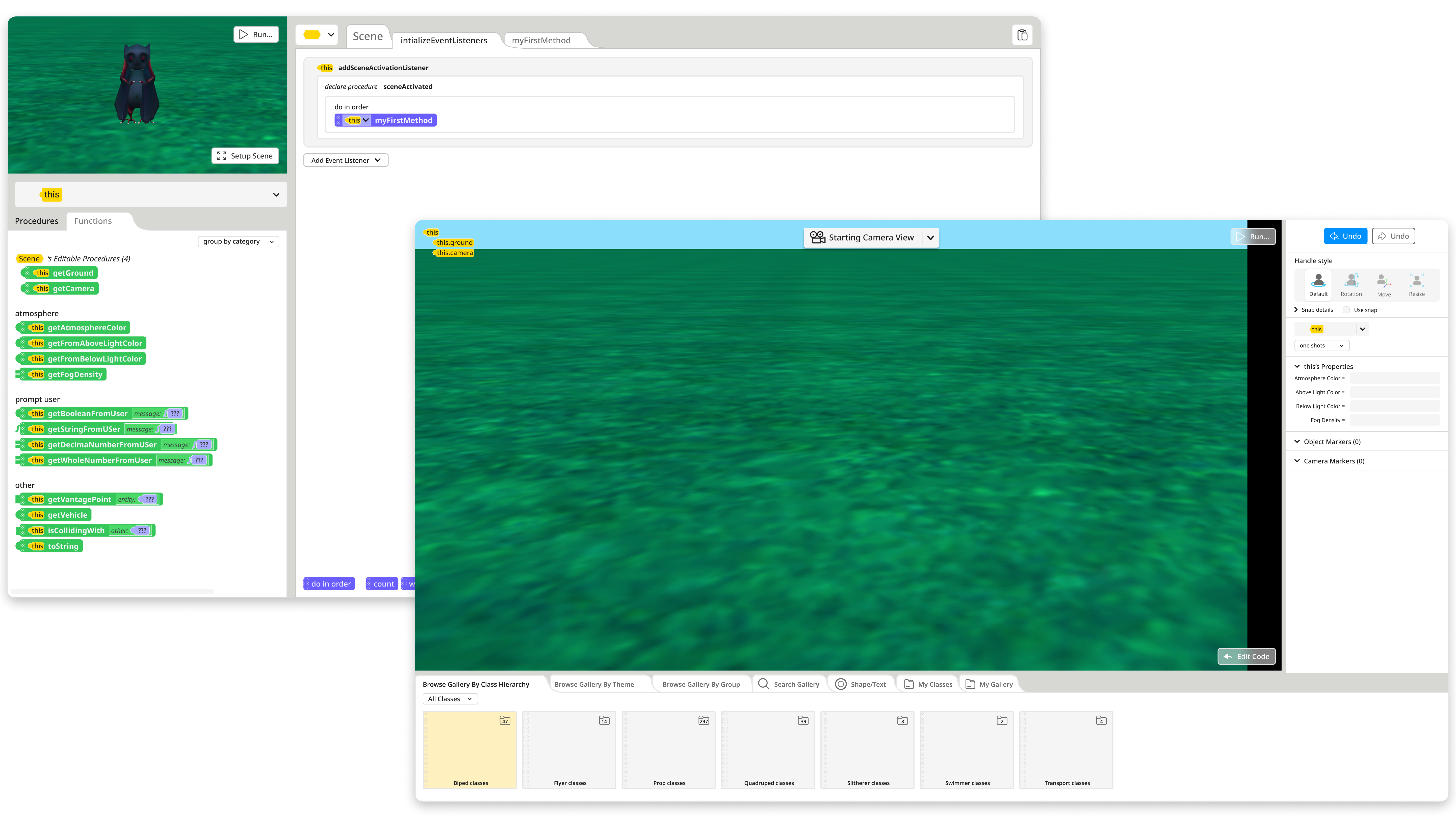
Pre-redesign interface
Seeing this 30-year-old interface, I immediately noticed the excessive colors, cluttered components, and irregular layouts, which revealed clear usability issues. I then worked with the development team and incorporated user feedback to modernize and improve the overall product design.
Usability
User-centered redesign
Modernization
To unearth opportunities, I conducted user research
My research revealed that Overcomplicated UI makes key features hard to use.

SYNTHESIS
Prioritization Matrix
How to optimize software usability quickly with limited team resources?
To prioritize features, I made a prioritization matrix to find out important funtions.

PROTOTYPE
Mid-Fidelity
Based on our team’s capabilities, project requirements, and user feedback, we have defined our MVP plan.
Child-friendly visual design
Simplified and readable interface
Technically feasible improvements
Maintain existing interface layout
Original
V1
V2


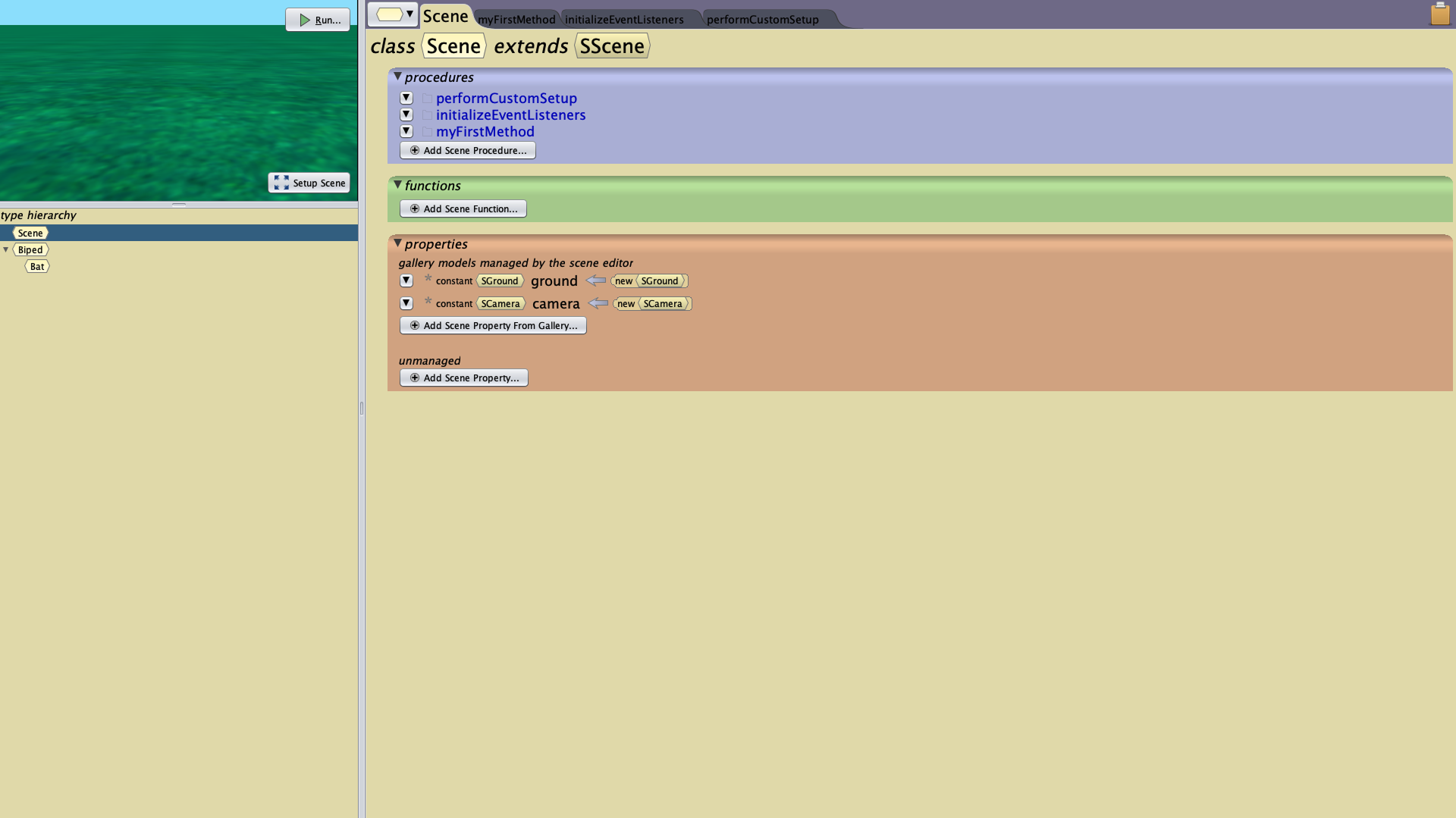
After discussions with the PM and the programmer, I learned that color helps users understand the software’s logic, so I use it more carefully.

To keep the interface visually simple, I removed most of the background colors.
V3

After team discussions, I understood that colors indicate different functions and classes, so I added matching colors to certain sections.

In the diagram, yellow = nouns, green = functions, purple = procedures. The software’s colors follow this mapping.
V4

In optimizing the Gallery UX, I learned that the original tab interface mimicked real-world folders, hence the yellow color. I kept this yellow, and used white to show items at the lowest level that cannot be opened further. This logic helps users see which items can be directly added to the scene.
V5
PROTOTYPE
Design Challenge
How to simplify the cognitive load for users?
Guide users through a consistent visual language, using colors, shapes, and hierarchy to convey attributes.


The excessive variety of value types increases cognitive demand, making it difficult for users to recall specific functions. Furthermore, there is a lack of clarity regarding command interoperability when users attempt to construct complex operations.
To help users, we've used color and shape to show the categories of each command and value, as well as how they can be combined.


The final design was validated for feasibility through team collaboration, with the addition of pop-ups and highlighting to enhance user guidance.
Logic-driven shape and color coding
Micro-interactions
Visual Guidance
PROTOTYPE
Component Library
How to ensure consistency between design and development?
The use of a component library streamlines communication with the development team. I provide assets in tailored formats and dimensions to enhance design clarity and reduce implementation errors.

PROTOTYPE
Final Design
Clearer guidance and enhanced usability for 2D/3D interfaces
Through playtesting, users demonstrated a smooth understanding of the visual guidance. Additionally, the UI specifically designed for 2D and 3D interfaces proved to be more readable than the original version.
Reflection
Takeaways
Optimizing a 30-year legacy system required a balance between technical feasibility (team-driven) and logic consistency (user-driven). My goal was to enhance the UI without disrupting the established user experience.
Additionally, I optimized the design-to-dev workflow. By staying in close sync with programmers during asset handoff, I was able to iteratively refine designs to solve technical issues and ensure on-time delivery.